


Michael Di Iorio chats with Leif Podhajsky, Sean Hogan and David Foster, the artists behind some of Apple Music’s brand new playlists.
Album art has been an iconic staple to the music-listening experience for years. A perfect album cover can make the perfect album even more special, and a terrible image on a failure of an album can make the project reach iconic levels of bad. The point is, imagery is important to the experience of music consumption, and knowing this to be true, Apple Music have hired thousands of artists to create unique and distinct artwork for each and every playlist on the streaming service’s entire archive.
The goal is to bring the same instant recognition we get from iconic album covers over to the playing field of playlists. To do so, the company enlisted everyone from the creator of the iconic AC/DC logo to the person who designed the art for Migos’ chart-topping album Culture to make it happen.
I spoke to three of these artists who are based in Australia: Leif Podhajsky, Sean Hogan and David Foster, to discuss how important music is to their creative process, and the creative intent behind some of the most incredible and homegrown pieces of art to grace your Apple Music library as of right now.
Leif Podhajsky – Visual Artist – Byron Bay
Currently living in Berlin, Leif is well-known for his distinctive album art and working with artists including Tame Impala, Kylie Minogue and Foals.
- How important is art to your own music listening experience?
I’ve always felt that music and visual artwork go seamlessly together. Something about connecting those two senses just adds to the overall experience. Personally I’ve always loved pouring over vinyl sleeves, it’s a window into a different world and one which can free you from the everyday. I think it’s changed a lot with digital music and how connected we are now, but there’s still something that fascinates us about the visual element to the music. In my practice it’s something I really invest a lot of time in, creating an environment that matches the emotion of the music. I want to create art that gives the listener a jumping-off point to begin a musical journey, setting them up to form their own unique interpretation of the music.
Music plays a massive part in the creative process also. I usually start by listening to the music I’m creating artwork for, really living with it. I also really love working to songs that are more long-form, mediative and without vocals. I find they allow the brain to slow down and free itself from overthinking, allowing the process to be front and centre.
- What was your inspiration when creating the artwork for the playlists; name them and the individual thought process behind them.
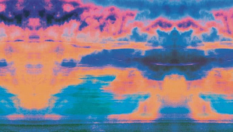
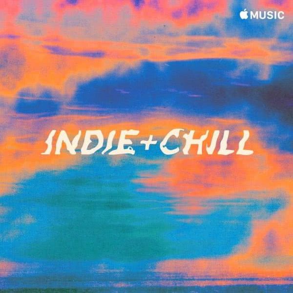
indie + chill – For this playlist, Apple Music was keen to focus on the Hypnagogic State, the transitional state between wakefulness and sleep. I set about trying to create something which referenced this transition. Reflecting the playlists hazy, warm and mellow feel, I developed an artwork which has this soft breezy motion to it. With both warm orange and yellow tones interplaying with softer blues. There’s a purpose there, but it’s not too specific to what that is, which I think helps the listener fill in the blanks with their imagination. It’s going somewhere but taking the scenic route. Sort of like the dreams you have after falling back to sleep in the morning.
With the typeface, we captured the attributes of the playlist artwork and created a mark which reflects this slow journey. The letters melting and distorting in the summer heat.
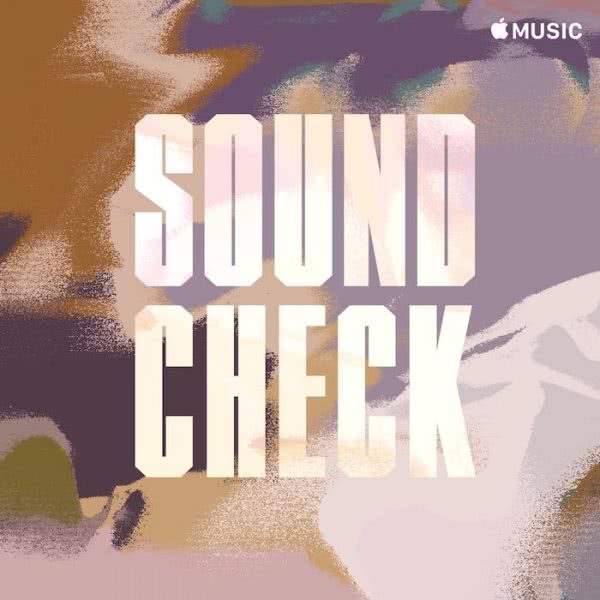
Soundcheck (Apple Music Country) – This was a really fun one to approach as the playlist focused around non-traditional country songs. A genre which is quite new and undefined in some respects. Apple Music wanted to use the camouflage pattern as a jumping-off point. A pattern which spans different genres, from hip hop, R&B to country.
I’d done some work developing my own modern camouflage patterns in the past which I was keen to expand on for this project. Where normal camouflage at its core looks to break up the form of the body and act as concealment, for this playlist we wanted to create a more modern approach. Using a contemporary colour palette and forms which referenced pop culture, we created a pattern which mimics the songs new and diverse sounds, whilst also in a sense giving this new genre an identity of its own.
Late Night Menu – This playlist offers up a selection of late-night indie songs, focused around the mood of an after-party. I created an artwork which explored this dark, late-night palette, mysterious tones intermixed with a soft glow of neon lights puncturing the shadows. It has a real sense of the afterglow of a big night out, where the dynamic has shifted into a more seclusive and intimate sphere. The type I gave a soft orange glow, like a distant street sign fading into the morning dawn.
- What challenges did you face in channelling your art style into a specific genre of music?
For me, it always comes back to communication. Not being too rigid in the approach to different projects and singling out specific themes and traits which will help give life to a project or musical genre. Working with Apple Music was really great as they came to the table with a lot of great ideas, but also allowed me enough freedom to explore my own angles. I think this really helps deliver quality creative.
- What songs currently inspire your artistic process?
I usually listen to mixtapes a lot, this sense of discovery really appeals to me. Hearing something new, a song you’ve never heard before. My daughter is up early so I start the day with a bit of BBC World Service, once I’m in the studio I’ll put on The Do!! You!!! Breakfast show on NTS with Charlie Bones, I love the mix of stuff he plays, also I get a nice taste of English banter which I miss being in Berlin.
Then if I’m working on creating something new I have some go to’s that always help me get in the flow, stuff like Om, Brain Eno, Neu!, Sun Araw. Or I’ll listen to a mixtape, I find these sounds are good for freeing up the mind and letting you wander. I run Melt (visualmelt.com) which as well as being a wellspring of visual information, also showcases interviews and mixtapes from contemporary artists and musicians.
I just went through a massive Young Thug phase, listening to all his mixtapes, on the flip side Blood Incantation..some psych death metal is always a good idea.
Sean Hogan – Graphic Designer – Melbourne
Sean is an established Graphic Designer from Melbourne who has created the cover arts for many of Apple Music’s electronic playlists including: Classicaltronics, Headspace, Next Tracks, Vibes and Signal to Noise
- How important is art to your own music listening experience?
Art and music go hand in hand for me. On an average day, I spend around 10 hours in my studio either making art or designing for clients, and I listen to music the whole time. But I think a better way of re-framing this question is: ‘how is music important to my art?’ I say this because music helps me make art.
Because my work is minimal, geometric and non-representational, listening to music acts as a facilitator that instigates thoughts and ideas.
There are also parallels between the two forms of music and visual art. In the language we use to describe them: harmony, balance, composition, discord, movement and rhythm, for instance; and in the way both forms can transcend description, but can still communicate; a colour has to be seen to be truly understood, a melody or beat has to be heard for a song to connect. Transcending description makes these languages totally abstract and therefore open for interpretation to the individual and this non-prescriptive, ambiguousness is something I’m very drawn to.
So, as a visual artist, music is incredibly important as a complementary language that I use to help drive inspiration in my work.
- What was your inspiration when creating the artwork for the playlists; name them and the individual thought process behind them?
I have created five different playlists for Apple Music. Four of them are for the electronic playlists and one for the classical (electronic) playlist.
For all of the playlists: Next Tracks, Headspace, Vibes, Signal to Noise and Classicaltronic, the inspiration was always the music.
The process involved listening to the playlists and really trying to understand the structure and mechanics of the music to create the visuals. Music is a system of organising sounds and I work using a similar system-based methodology, just in the visual realm.
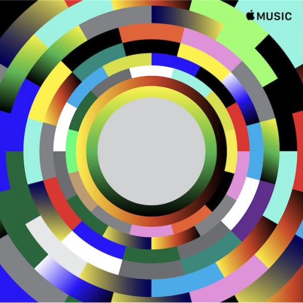
Responding to the music, I translated musical notes as colour, and scales or shifts in tone as gradients moving from one colour to the next.
The way we ‘read’ colour is something I’m interested in. We learn to read colours in many ways and one of those readings is to equate colour with emotion. A pastel colour palette is read as being softer (and perhaps safer), calmer or less abrasive than a palette of bright opposing colour, which may be read as harsh or garish.
This idea of harmony and discord, the shared vocabulary between music and art, is an idea I exploited in the creation of the playlist artwork and was an important consideration in the overall compositions.
Electronic music has an artificiality about it (in a good way) and it felt important to include what I call ‘artificial’ colours, or hyper-real colours, into the palette. They form part of the digital colour palette of our screens, colours that are backlit with a white light that give off a unique glow or iridescence not found in print. By selecting colours like neon green, or a Klein-like blue, a connection is immediately made between the electronic music, the colour palette and the platform in which you are viewing and hearing these works.
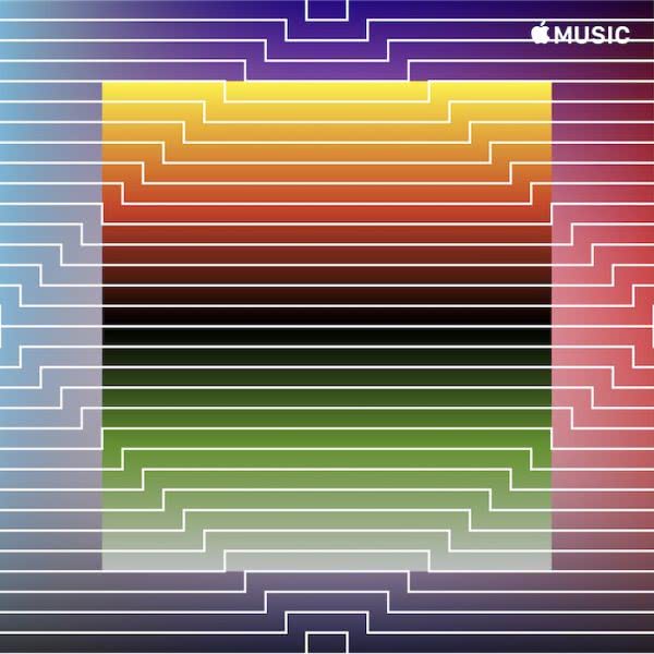
For each individual artwork, it was then a matter of figuring out a suitable composition using the relationships between the geometric forms, the linework and the colour configurations to respond to each playlist. As you can imagine, it takes time, and a single design may go through hundreds of iterations before it speaks the same language as the music.
- What challenges did you face in channelling your art style into a specific genre of music?
I think Apple Music specifically chose artists whose work they knew was sympathetic to a specific genre of music.
My work has always been interested in the exploration and interface of the dual worlds we now find ourselves in — the electronic/digital world and the natural world. So I was delighted when I was appointed the electronic playlists, as it is a genre I know well and that aligns with my work.
The biggest challenge was trying to come up with one image that would be responsible for representing an entire genre or subgenre of music.
A playlist is made up of many different tracks and these playlists change, so the difficulty was in trying to find a visual language that echoed the genre of music rather than a specific track.
Another consideration in the design process was thinking about how these visuals would be viewed. For most people, they are viewing the images on a phone which makes the image smaller than a postage stamp so I was aware of keeping the artwork quite bold so it was easily recognisable and no detail would be lost in the reduction of the work.
- What songs currently inspire your artistic process?
There are many and it’s a constantly revolving list. At the moment I would list: ‘Vortrack’ – Squarepusher, ‘Hypokondriak’ – Plastikman, ‘What You Don’t See’ – Ike and Tina Turner, ‘Slow Slippy’ – Underworld, ‘We Share Our Mother’s Health Shaken-Up Version’ – The Knife, ‘Target Line’ – Rødhåd, ‘Journey in Satchidananda’ – Alice Coltrane, ‘Invincible’ – Tool, and many more.
David Foster – Type and Lettering Designer – Sydney
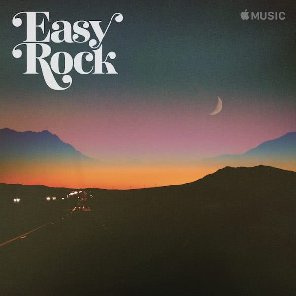
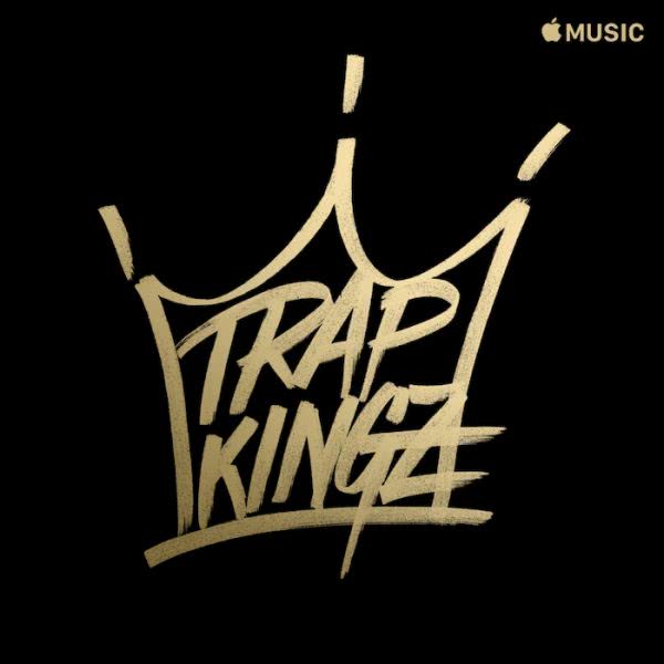
David Foster created the type and lettering for the Apple Music playlists: Trap Kingz, Puro Jefe, Dale Reggaeton and Easy Rock.
- How important is art to your own music listening experience?
Some of my earliest memories of listening to music are to do with the album artworks. I think it’s a common experience shared by many people. Back then the packaging was definitely a lot more tactile than now but it doesn’t diminish the impact of the art on a listener.
I find playlist art helps me the same way a book cover, a movie poster or a wine label might help me navigate a space I’m unfamiliar with and jump out at me, or help me connect with something where I already know I’m looking for.
- What was your inspiration when creating the artwork for the playlists?
My inspiration largely comes from researching the broad visual language of whatever kind of music or subculture I’m trying to help communicate. I try to listen to as much of the music as I can and get the vibe of it and try to understand why people connect with it. I also look at the fashion, the design work and whatever else I can find. When I did these playlists for Latin music, it was all completely new to me, I really had no clue that they even existed. But by researching, it opened up some ideas I could begin sketching with.
- What challenges did you face in channelling your art style into a specific genre of music?
One of the challenges about playlist art is that it can’t really fall back on some of the typical ways an album for a particular artist might be designed. For example, you can’t use photography or illustrative work of one particular artist. In addition, you don’t want to patronise the audience by bringing up tropes or stereotypes.
One of the best things about type and lettering specifically is that it can be like a chameleon. Type is around us all the time, and every style of music has type styles you can reference. It doesn’t need to be overtly obvious and yet it can communicate really clearly what the playlist is about while also showing the name of it.
- What songs currently inspire your artistic process?
The songs that influence my creation of the playlists are literally whatever is on that playlist directly. My personal taste in music doesn’t play a large part in it. Outside of any work I do album art, I’ve been loving the work and general outlook of Paul Kalkbrenner.
There are strong parallels between his approach to creating music over a long career and type design. The quality he expects of himself but also the understanding he extends to himself. He understands that not everything he can make over a lifetime will be perfect or as good as he wants, but he continues to create anyway.
With any creative pursuits, including my own, I think many people should be kinder to themselves because they hold back things from the world because they think they’re not good enough, but they’re necessary steps to get to the good creative outcomes.