When Joe Rogan announced he would be making the move from Los Angeles to Texas – along with his podcast The Joe Rogan Experience – fans weren’t sure how it would turn out.
The host debuted his brand new “man cave” in a recent episode – 1533 – featuring guest star Adam Curry, who had been a part of his podcast previously in L.A.
Aside from pointing out the trainwreck of an interview in which fans pointed out that Joe constantly interrupted Adam, after seeing the very red, bunker-style podcasting room, fans also have a lot of thoughts about the new pad – and they’re not necessarily good ones.
“This set is horrible. The lighting, the angles, the feel of the room, everything. Please, Joe. Please, Spotify. Just… NO,” one Youtube user commented, referencing Rogan’s recent $100 million Spotify deal.
A Redditor added, “Yes his new studio is horrendous. Makes the podcast tough to watch. Who’s idea was that?”
“The new set looks like the inside of a tanning bed, on DMT,” a third fan added.
Joe Rogan’s studio in Texas is like if you were eaten by Darth Maul and set up a wellness retreat in his stomach. pic.twitter.com/ImI7Q2Efpo
Love Music?
Get your daily dose of metal, rock, indie, pop, and everything else in between.
— Elena Saavedra Buckley (@elenasb_) September 7, 2020
Defeat the alien's head to enter joe rogan's set pic.twitter.com/kbSBtQajrO
— Kevin Lieber (@kevinlieber) September 9, 2020
https://twitter.com/trevsded/status/1303811859745701888
https://twitter.com/cliche_mom/status/1303485101754454018
Joe Rogan's new studio set up looks like the inside of a toaster wtf 🙁 pic.twitter.com/M8MPPMsL9E
— Mbongwe (@NinoSekeleni) September 9, 2020
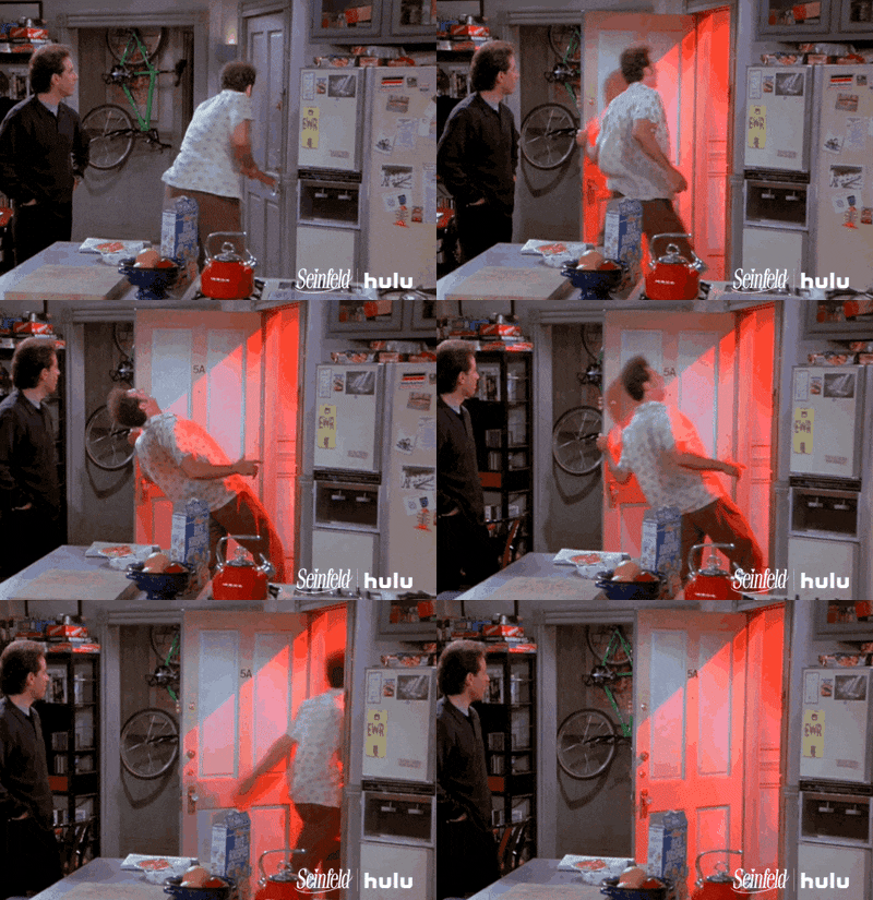
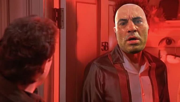
It’s hard to pinpoint exactly why Joe’s new set is so jarring – but lucky for us, Tech Youtuber Sara Dietschy has blessed us with her expertise and broken down all the reasons why we hate Joe Rogan’s new podcasting room so much – aside from the glaring red surroundings that look like the time the Kenny Rogers Roasters light was shining into Kramer’s apartment on Seinfeld.

Basically, Dietschy explained that the reason it looks so unpleasant is due to a bunch of (super interesting) technical choices.
Frames per second
“I shoot my video in 24 frames per second,” Sara begins. “And all that means is that essentially there are 34 pictures for one second – some people use 30.”
“All this comes down to basically saying that if you’re shooting an interview or something very basic like people talking, just don’t use 60 frames per second.”
She goes on to say that if you move your hand in front of your face, that provides natural motion blur, and if our eyes were to see in 60 frames per second, that blur wouldn’t be there – hence why watching something in 60 frames per second can look very unnatural.
“Unless you’re watching sport or filming a cheetah [then don’t use 60 FPS]”.
Depth of field
“When it comes to the background, it’s actually really pleasing to the eye to have some depth,” she says, showing that her own office used as a background will show up as “all bokeh and blur when I’m sitting in front of the camera.”
“If you can’t have that, textures are important. That’s why you see a lot of curtains in the backgrounds of podcasts,” she explained. “The more soft things you have, the better the audio is going to sound – plus it makes for a great background.”
Video angles and type of camera
“The type of camera they’re using that I can see from Instagram is a video camcorder – kind of reminiscent of the dad cams they take to soccer games and stuff,” she said.
“These cameras usually have a smaller sensor compared to what I’m using right now which is an A7iii which is a full-frame sensor. So having a camera that starts at f4 doesn’t help you when it comes to having depth in your shot. So not only are the super close to the wall, but there is zero depth when it comes to bokeh from the camera,” she added.
“A camera starting at f2.8 is going to help you get that more shallow depth of field.”
She continued that framing is of huge importance, noting that the Joe Rogan episode in question shows his guest with a substantial amount of space above his head, something that is naturally displeasing to the eye.
Lighting
“Oh my goodness,” Sara said in regards to Rogan’s use of lighting. “I thought they could have kind of been in a hurry and threw some LED panels in the back, very oddly placed.”
“Soft lighting!” she continued, “How are you able to diffuse the lighting? You want to be able to diffuse it, not just point it directly at you. You either need a softbox or a light dome… so it’s a nice, pleasing light on the person’s face.”
Joe, take note!


